Storstockholms Lokaltrafik — UX Intervention — 2024
Changing the Way Commuters Buy Tickets
About
Trafikförvaltningen, Region Stockholm is responsible for public transport in Stockholm County. It manages the Storstockholms Lokaltrafik, commonly known as SL, the county’s public commuter system used by over 300,000 residents every day.
Role
User Research
App UI/UX Design
Graphic Asset(s) Illustration
App UI/UX Design
Graphic Asset(s) Illustration
Length
3 Weeks
Team
Project done as a part of my MA at Hyper Island
Jeonghu (Jamie) Park
Vala Rún Magnúsdóttir
Ragnar Gunnarsson
Academic Collaboration

challenge & Execution
Commuters usually purchase tickets through one of two methods: via the SL mobile app, or via 3rd-party agents at the stations. Our task was to convert the latter group of commuters into building a habit of using the SL app to purchase tickets instead, reducing the commission that the SL had to pay 3rd-party agents.
Over a 3-week sprint, following the Stanford Design Thinking method, we conducted user research and deviced a series of physical and digital solutions that built on existing infrastructure so that the SL could implement them with ease.
Over a 3-week sprint, following the Stanford Design Thinking method, we conducted user research and deviced a series of physical and digital solutions that built on existing infrastructure so that the SL could implement them with ease.

Research
We kicked off our research with a service safari of all the services offered by the SL in Stockholm, identifying paint points in the commuter experience.

We also studied the structure of the companion apps of other public transportation services in Scandinavia and Europe to gather insights on the user experience and navigation flow.

We conducted our preliminary round of in-person user interviews at KTH University and at metro stations to get a mix of locals and newcomers. We intended to find out if and how they used SL’s services, and their reasonings for doing so.

After narrowing down our target demographic to just locals, we conducted a second round of interviews with locals who were aware of the SL app, but chose to not use it.

The Problem
Using the insights from our research, we finalised on a problem statement.


The Solution
Based on the problem at hand, we formulated a series of physical and digital solutions that utilised existing infrastructure so that the SL could implement them without expending a significant amount of resources.

When ideating digital interventions for the SL app, we started by identifying pain-points in the user journey to use as points of focus.

Our first suggestion was the inclusion of a structured onboarding process. The current app offers no guidance, and this onboarding should help users understand the app’s features and benefits.

There are two ways of using a ticket purchased on the SL app: via an in-app QR code, or via the physical card. A ticket purchased for one method cannot be used with the other; and the existing user flow does not communicate this clearly. This can be solved for by changing the app’s tab structure.

The existing ticket categories are unclear and misleading; and although descriptions are available, most users don’t read them. We proposed a more intuitive re-categorisation.

The current payment methods are limited to Swish and credit cards, which is both limiting and slow. Integrating wallets like Apple Pay and Klarna will make payments more convenient.

Users were unsure if purchased tickets were activated immediately. We proposed adding a confirmation screen after ticket purchase, giving users the option to activate the ticket either immediately or later.

The app could use notifications more effectively to provide users with useful information about active tickets and remind them to top up when the time comes.

Testing
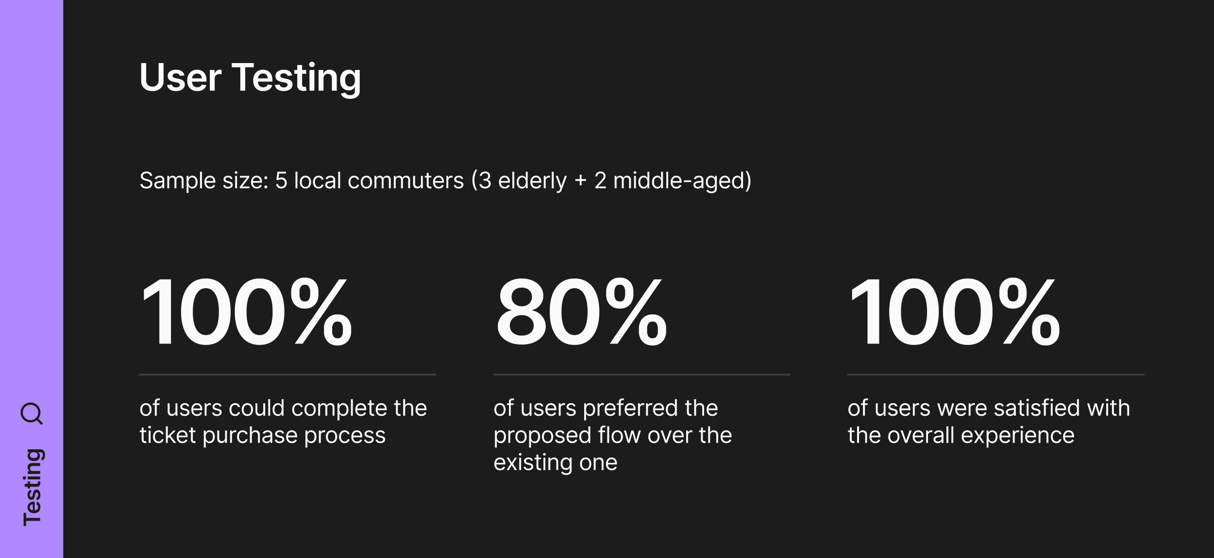
Following internal testing and refinement of our prototypes, we conducted some real-world user tests to verify the effectiveness of our solutions.


Result & Impact
The client expressed appreciation for the extremely practical nature of our solutions. They affirmed that our research insights closely matched the ones produced from their internal tests, thus serving as useful points of validation for them.


